Website Accessibility: What, Why, Who, and How for Your Firm's Website
Share this
Many years ago, I attended a session on website accessibility during a conference I was speaking at. I hesitate to admit the idea of website accessibility was a new concept for me, and I left the session sufficiently terrified my organization was on the brink of a lawsuit for non-compliance and completely overwhelmed on how to even start tackling this with our sites. The good news is website accessibility is not nearly as scary as I thought (and no, my organization never faced a lawsuit). With a little background on the subject and some helpful tools, you'll be well on your way to ensuring your site meets (or exceeds) some basic standards.
What is Website Accessibility?
W3C Web Accessibility Initiative defines website accessibility as ensuring “websites, tools, and technologies are designed and developed so that people with disabilities can use them.” Specifically, individuals should be able to navigate, understand, interact, and contribute.
Website accessibility includes permanent disabilities, short-term disabilities (e.g. broken arm), and situational limitations (e.g. unable to listen to audio in their current environment). As an added bonus, website accessibility can also benefit individuals using mobile devices or with slow internet connections.
Why is Website Accessibility Important?
The purest answer to why you should care about website accessibility is because it’s the right thing to do. Beyond that, there are compelling business reasons to ensure the accessibility of your website. The four primary reasons W3C WAI lists for accessibility are:
- Driving Innovation. Building features to enhance accessibility can have the added benefit of solving unanticipated problems
- Enhancing Your Brand. A commitment to accessibility boosts your brand’s diversity and inclusion efforts
- Extending Your Market Reach. Not only does accessibility improve the online experience for all users, it can also lead to potential clients (it’s estimated the spending power of over one billion individuals with disabilities is more than $6 trillion).
- Minimizing Your Legal Risk. Knowledge of accessibility is increasing and so is scrutiny. Many countries now have laws requiring digital accessibility.
For most companies, their website is a key platform (if not the primary platform) for customer interaction. This is no different for independent financial advisors. Putting your best digital foot forward establishes your firm’s commitment to inclusivity.
Who Creates Web Accessibility Guidelines?
The World Wide Web Consortium’s (W3C) Web Accessibility Initiative (WAI) is widely regarded as the authority for web accessibility. W3C is an international community made up of member organizations, staff, and the public who collaborate to develop web standards.
W3C’s process for creating accessibility guidelines is consensus-based involving various stakeholders. You can read more about their process here.
How Do You Check Your Firm’s Site for Accessibility?
W3C provides an extensive list of tools for testing your website for accessibility compliance. Before you get overwhelmed by the list, let me point out two tools I love.
WAVE Web Accessibility Evaluation Tool
Possibly my favorite thing about this tool is its Chrome Extension. Once it’s installed, navigate to your site (or any site if you’re curious enough to look), click the extension icon to activate, and you’ll see a left menu appear along with icons scattered all over the page.

The first tab of the report on the left menu is a summary of the page you’re viewing. The key areas you’ll want to focus on are Errors and Contrast Errors. Once you’ve addressed those two categories, you will want to review the Alerts too, but your biggest priorities are the red categories.
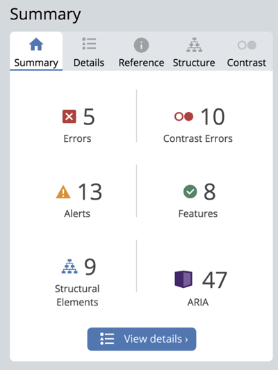
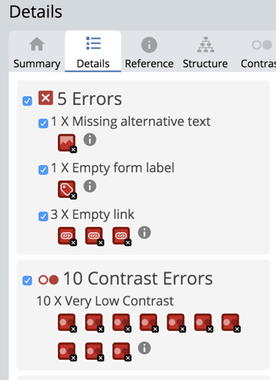
If you click on the View details button or the Details tab on the top, you’ll see a list and explanation of icon.
If you click on an icon from this list, the screen will jump to the specific area of the page where the icon is located. All elements are interactive so if you click on them, additional information will appear.

Back in the left menu, you can also click on the information symbol next to any category for a definition of what the error is, why it matters, and how to resolve.
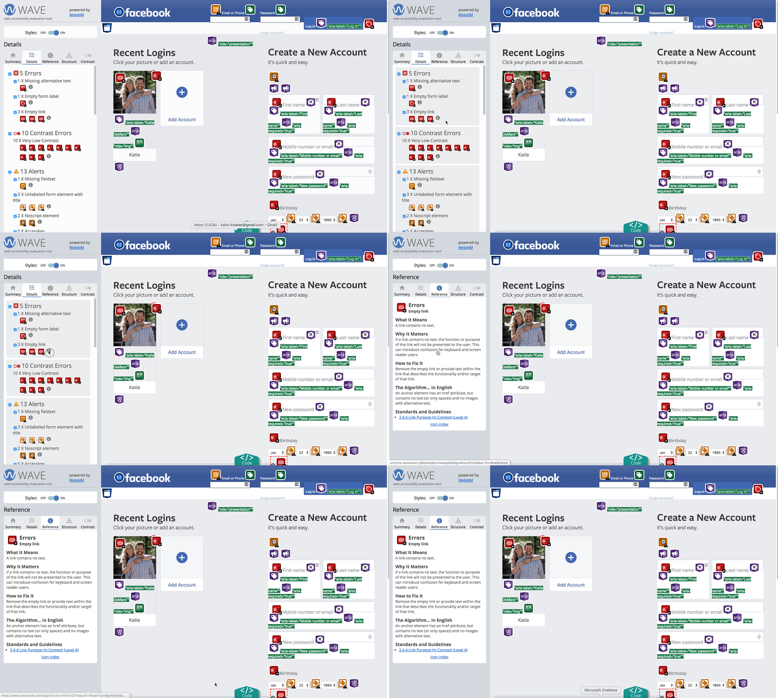
Prioritize the red categories (Errors and Contrast Errors) for each page of your site before moving on to the Alerts.
This tool will help you address any Contrast Errors you receive when you run your WAVE test. All site viewers need basic contrast to distinguish text on your site, and this is even more critical for anyone with a vision impairment. With this tool, you can enter the color of your text (foreground) and background to check the contrast ratio. Web accessibility guidelines suggest a minimum ratio of 4.5:1. Move the slider below the color sections to test different tints. You’ll notice the contrast ratio box updates as the color values change.
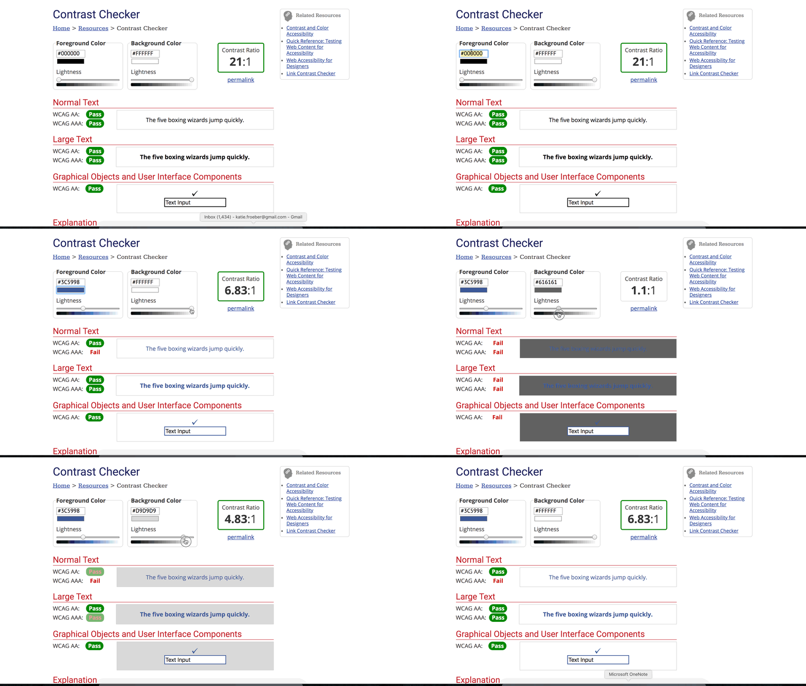
The sections below the color boxes show the ratings for normal and large text (defined as 18.66 px or larger in bold font-weight and 24px or larger in normal font-weight) as well as graphics (such as your logo). Shoot for a minimum of WCAG AA to PASS when evaluating a specific category.
Utilizing these two tools can get you started on your path to improved accessibility for your firm’s site. Rest assured, you do not need to overhaul everything right away. Start with the biggest areas of concern (the red categories in the WAVE report) and go from there.
Good luck!
 About the Author
As XYPN’s Webmaster, Katie DeMars plays a major role in communicating XYPN’s value proposition to the world through digital mediums. Her career experiences span marketing and web roles giving her a unique perspective when approaching each project. Katie is passionate about creating exceptional virtual experiences and is excited to share XYPN’s story through digital platforms.
Share this
- Running Your RIA Efficiently: Outsourcing Bookkeeping with XYPN Books
- Road to Launch with XYPN Member Alan Skillern, CFP®, MBA
- Coaching for Better Time Management: Prioritizing Organic Growth in Your Daily Routine
- Boost Your Financial Advisory Practice: SEO Strategies and CRM Optimization for Sales Success
- Advisor Blog (693)
- Financial Advisors (221)
- Growing an RIA (99)
- Digital Marketing (87)
- Marketing (84)
- Community (81)
- Start an RIA (76)
- Business Development (72)
- Coaching (72)
- Running an RIA (70)
- Compliance (69)
- Client Acquisition (65)
- Technology (64)
- XYPN LIVE (59)
- Entrepreneurship (57)
- Sales (49)
- Practice Management (44)
- Client Engagement (41)
- Bookkeeping (38)
- XYPN Books (38)
- Investment Management (37)
- Fee-only advisor (36)
- Lifestyle, Family, & Personal Finance (31)
- Employee Engagement (30)
- Client Services (25)
- Financial Education & Resources (25)
- Journey Makers (21)
- Market Trends (21)
- Process (14)
- Niche (11)
- SEO (9)
- Scaling an RIA (9)
- Career Change (8)
- Transitioning Your Business (7)
- Partnership (6)
- Transitioning To Fee-Only (4)
- Social Media (3)
- Transitioning Clients (3)
- Emerald (2)
- Persona (2)
- RIA (2)
- Onboarding (1)
- Sapphire (1)
Subscribe by email
You May Also Like
These Related Stories

The Anatomy of a High-Converting Website
Nov 5, 2020
4 min read

Free (Or Almost Free) Tools to Freshen Your Firm's Website
Dec 26, 2019
6 min read


